Baton Rouge Pay-Per-Click Agency News: Google Clears Right Hand Rail
Subtle changes in real estate and your daily landscape can be very noticeable. Whether it’s a neighbor that painted their shutters or even fresh mulch around the crepe myrtles that dot the median in your neighborhood; even understated alterations will catch your eye. New developments being planned and built are the same way; a strip mall going up on a lot that’s been empty for years can leave you scouring for “coming soon” signs and making guesses as to what may be opening. However, while making additions and improvements to the scenery you pass every day is exciting, there is something to be said for removing some of the staples that make up your daily backdrop. Finally demolishing that Blockbuster that has sat vacant since Netflix became a verb, your neighbor selling that old car that has blocked the sidewalk since before you moved in, and seeing that unnecessary 4-way stop that extended your commute replaced with a stop light are all examples of how less is more.
The digital real estate you navigate every day is following this same principle. Google, the top ranked website and search engine in the world, has just made a major revision to the site that millions of people visit every day, and no it’s not the latest “Google doodle”. Based on research and experiments that date back to 2010, Google will no longer show ads on the right side of the screen of desktop searches.
If you went to Google, even as recently as Friday (February 19, 2016) you would have seen what you’ve pretty much always seen. Three ads at the top of the screen, a list of ads running down the right hand rail and adjacent to that right angle of AdWords, you would have found your organic search results. Today you’ll find three to four ads at the top of the page (depending on your query); followed by 10 organic results and the page will end with three more ads at the bottom of the page.
Why The Change to Google’s Pay-Per-Click Environment?
So why the sudden change? It actually wasn’t that sudden. Starting in 2010 Google began experimenting with four ad placements at the top of the page for “mortgage” based keyword queries. This expanded AdWords section will remain in place for what Google defines as “highly commercial queries”, i.e. hotel rooms, car insurance, etc. The change to remove right hand column ads also supports Google’s philosophy of mobile first design. Early last year Google confirmed that the moment they had been anticipating had arrived: mobile now accounts for over half of Google’s web searches worldwide. Removing the right hand column ads creates a consistent look between their mobile and desktop platforms.
In 2014 Google earned $66 billion in revenue. Over $45 billion, or 68%, of that came from AdWords; so making a decision to reduce the amount of ads served from 11 or so to a new maximum of 7 was not made hastily. So, how do they plan to make more money with less advertising real estate? Let’s look at what will actually be missed. Ads at the top of the page account for 85.4% of clicks, as opposed to only 14.6% from the right hand column and bottom of the page ads. When you account for the additional top ad and the remaining bottom ads, the difference in actual clicks should be negligible.
What Does This Change Mean for Searchers on Google?
For most, typing in a search query at Google.com, this will likely go unnoticed. However, the user-experience (which is a top priority for Google) will almost certainly be enhanced. Ads with higher quality scores and relevance to keyword searches will be rewarded and shown to searchers. There will also be an opportunity for Ad Extensions (as this was not an option for ads in the right hand column). It is also important to know that just because there will be no text ads on the right had column, that doesn’t mean it will remain an empty wasteland. For certain search queries and keyword categories, the right hand column will remain the home for PLA’s and Knowledge Graphs. PLA’s (Product Listing Ads) are a group of images, reviews and links to a particular product (see below). Knowledge Graphs are a system devised by Google to understand facts, people, places and things and how they are all connected in relation to a particular search query. The goal of the knowledge graph is to provide answers and not just links.
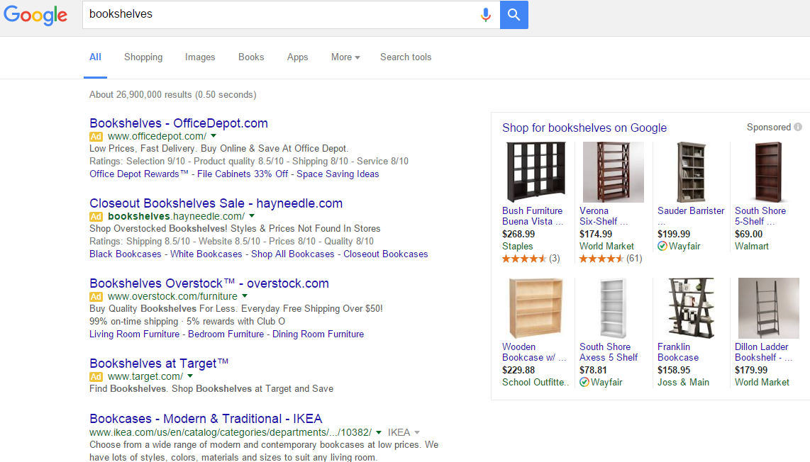
PLA (Product Listing Ad)
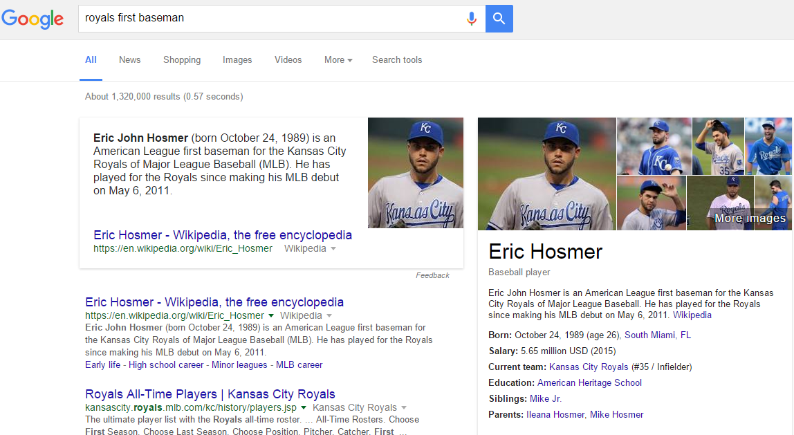
Knowledge Graph
What Does This Change Mean for Pay-Per-Click Advertisers?
While this could sound like a scary challenge for advertisers, as logic suggests that fewer ad results means fewer impressions and more competition, that isn’t actually the case. With the overwhelming majority of clicks and conversions coming from the top ad block, very little ROI will actually be missed. In fact with the possibility (depending on the search) that there will be an additional ad served at the top of the page, the laws of supply and demand will actually make it more affordable to land in this prized block. It also means that advertisers will be able to craft more insightful, relevant and helpful ads for searchers. As mentioned above, including site links and ad extensions is now an option that wasn’t supported in the right hand rail. Ad extensions are proven to enhance CTR (click-through-rate) and conversions and are considered a best practice by Google. It is also important to consider that with the majority of searches being done on mobile devices that these right hand column ads weren’t being shown to begin with. So this new revision of the AdWords platform can be a great opportunity for pay-per-click advertisers.
This is a brand new and fairly drastic change from Google. Time will tell how these changes will influence buying and advertising habits, but be certain that if Google didn’t see this as an advantage for its main revenue stream, they wouldn’t have made this move. This development begs several more questions, like “how will this impact organic results?” Again time will tell, but the only real impact it is having currently is that when a 4th ad is shown in the top block that it pushes the first organic result below the “fold”. However in a world where we spend more time on mobile devices, most users are inclined to scroll, so this may prove to be a non-issue. While change can be intimidating, it is the one constant in the world of Google. Just like the weather in Louisiana, if you don’t like what’s happening now, just wait a few minutes and it will change.

